About the project
When Axis Mutual Funds approached us for a complete revamp of the online experience they offer consumers and distributors, we knew it was a chance to bring a more human centered approach to an industry that has typically been ruled by jargon and complex business processes.

As mutual funds increase in popularity as the preferred instrument for investment in India, we at Fractal Ink Design Studio realized the importance of creating an experience that empowers both absolute newbies to investments, as well as experienced investors to make informed investment decisions.
Some of the highlights of our design solution
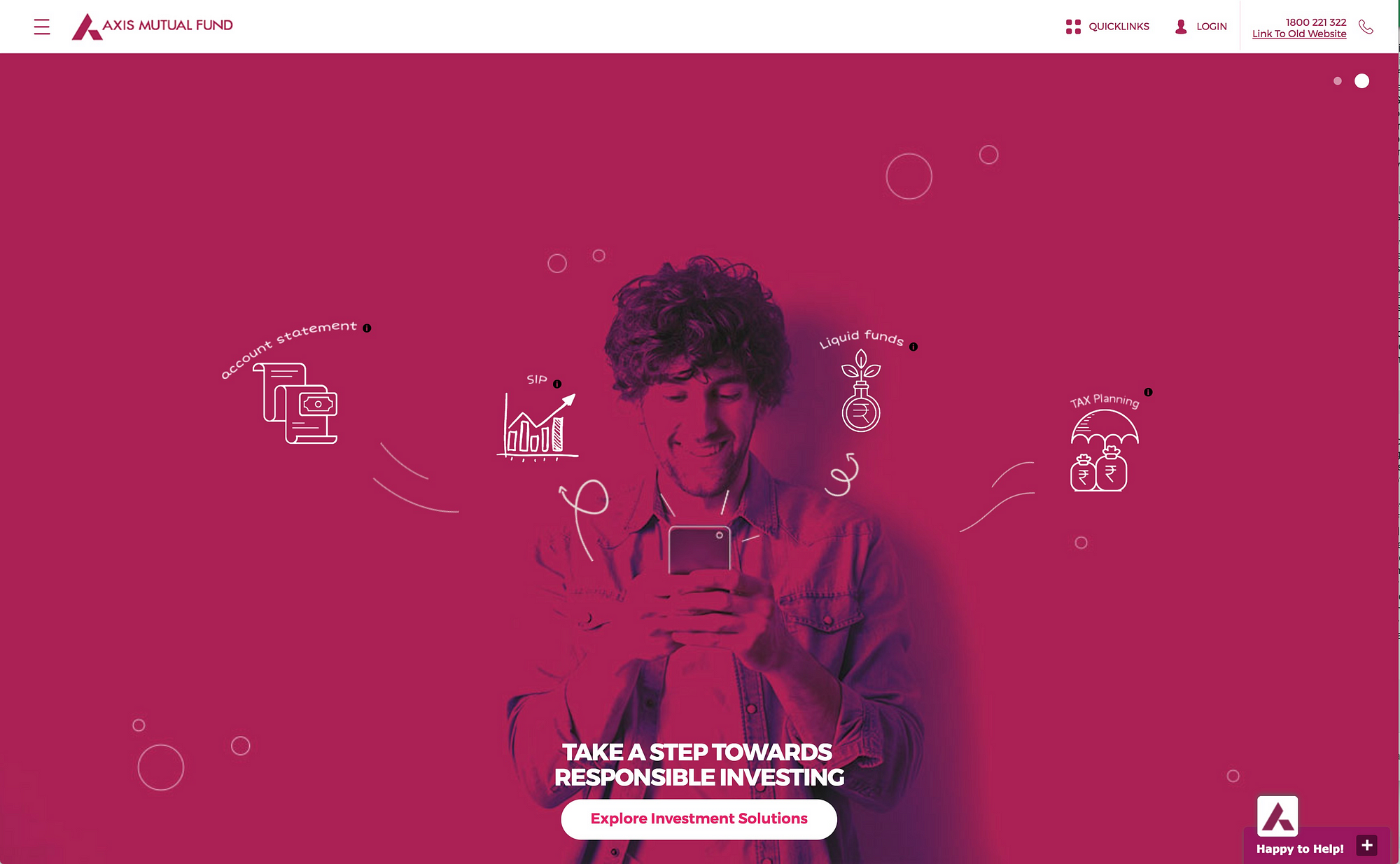
Simplified landing page
The new website features few but prominent entry points into the most used functionality. It has a focus on easy discoverability of products and services.
The simplest investment calculator ever
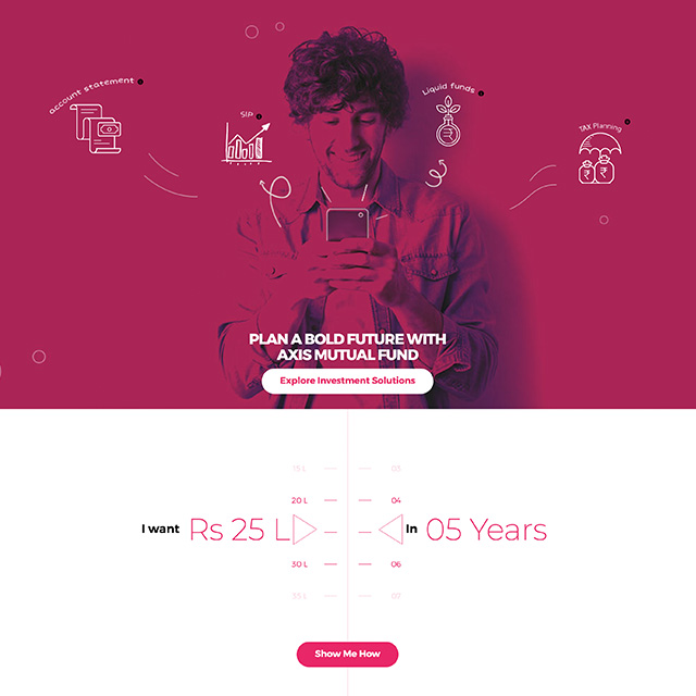
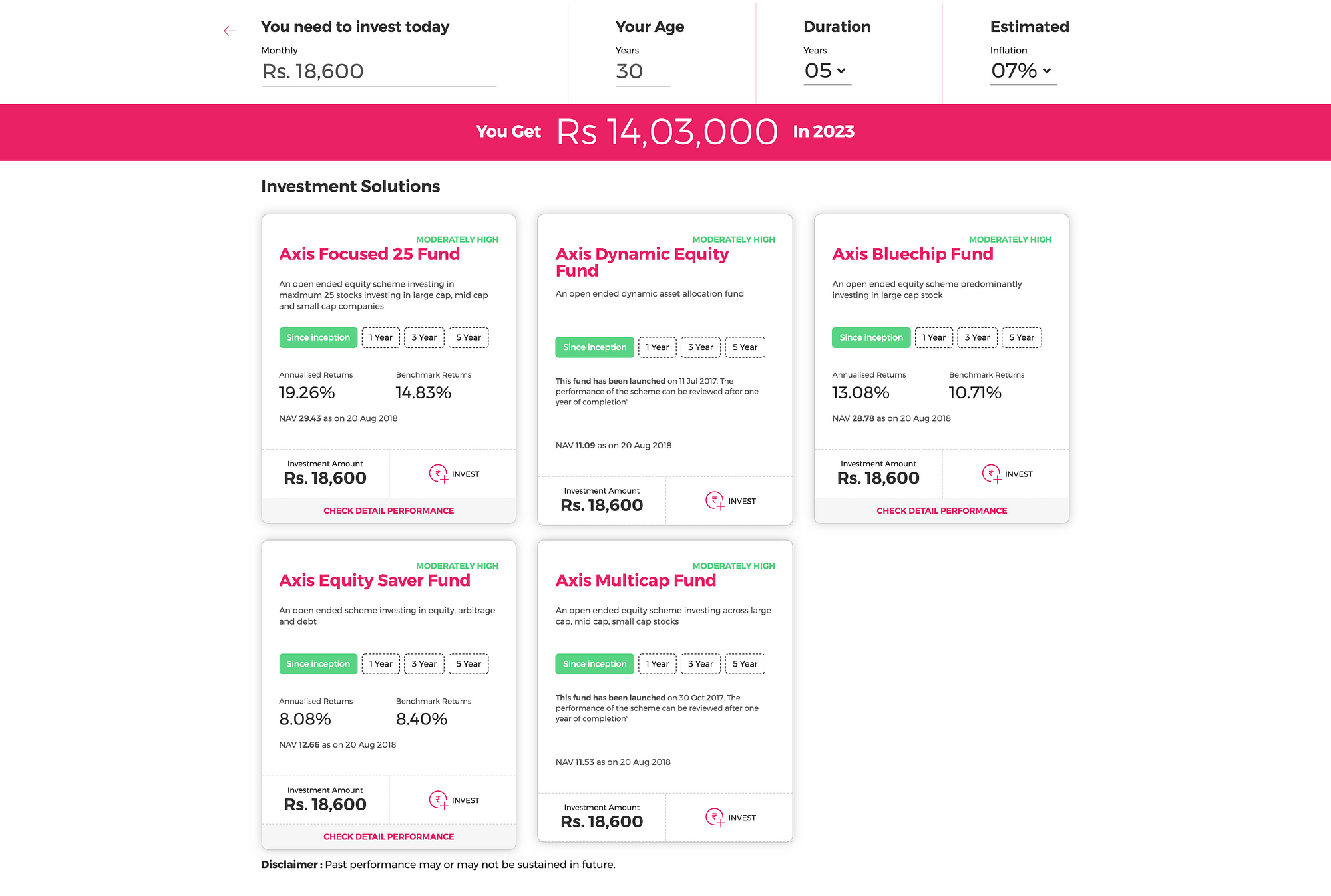
Most investment calculators in the market have too many variables that many customers do not often know what to do with. We simplified things for them and made a calculator that speaks their language. When a user wants to know how to get a certain amount of money in so many number of years, we show them which funds to invest in to help achieve their goals.

Cleaner product display
The new fund browsing experience optimizes for letting new investors find the key data points that they will likely need to understand what fund they are looking at. The Revamped product cards made it easy for new as well as experienced investors to make decisions about where to invest.
A guided investment journey for new and experienced investors alike
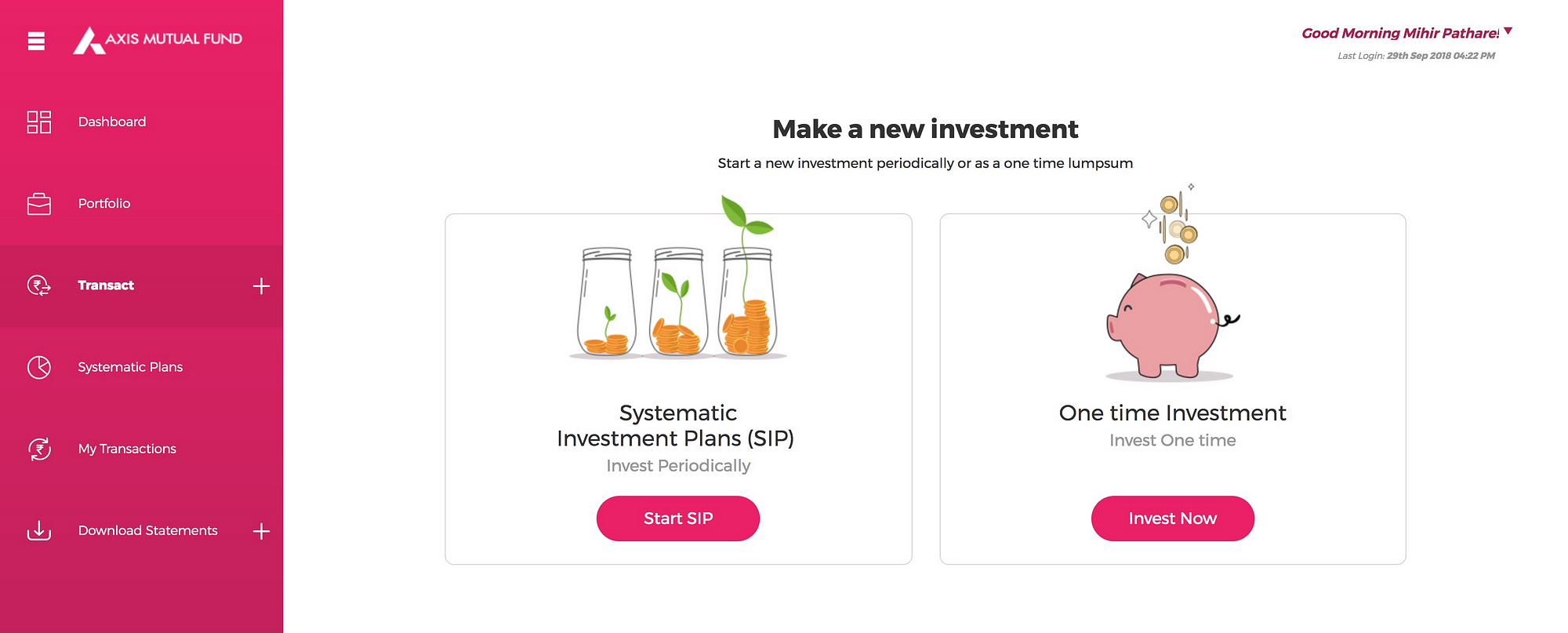
We made a journey that allows experienced investors to directly zero in on the mutual fund they want, while still allowing inexperienced investors identify the funds they want based on fund types.

Customer focused investment journeys
Traditionally, online investment journeys are typically dictated by the technical and legal constraints of the product. These were marked by lots of redundant data entry, incoherence about the steps the user takes, and was essentially a replication of a paper form online.
Our approach
Based on our research of market trends, interviewing consumers about website experiences with leading mutual fund companies in the country and benchmarking existing solutions, we found out that the the biggest challenges consumers face are antiquated jargon, inefficient processes and redundant data entry. These became the focal points of our redesign efforts.
The old website was typical of a years old web property that has slowly been renovated piecemeal.
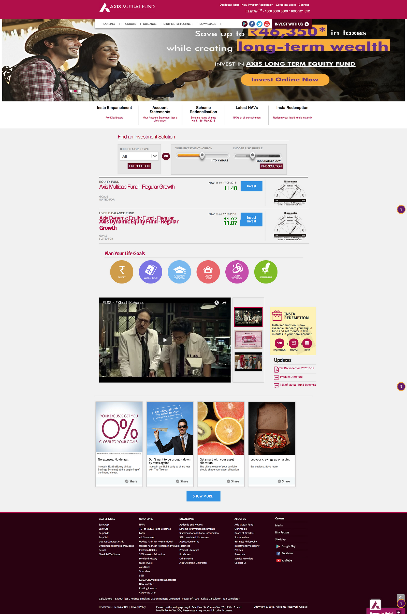
The website suffered from having too many things vying for the user’s attention at once. Axis Mutual Fund knew they needed to bring the focus back to their offerings, and their products, and streamline the experience on the website.
The first steps — understand the lay of the land
The first step in the redesign effort was taking stock of the existing products, services and infrastructure behind Axis MF, and the mutual funds industry as a whole. We surveyed the state of the market, and also found a lot of insights were to be gained in the SEBI annual report about mutual funds in India. We looked at competitor offerings as part of our benchmarking research. We made high level service maps and customer journey maps on axismf.com to understand what needed improvement.
Getting insights from the sitemap
Part of understanding what we’re dealing with, we mapped out the entire website. This helped us make a content inventory, identify redundant and dead end navigation, and optimize the content model.

Formulating the strategy

The basic approach for the website redesign was simple. We had to empower the customer to buy mutual funds on their own terms, going through the usual steps of learning, exploring and making their own decisions based on their own needs.
SWOT’s going to happen?
SWOT is not a cliche. It’s a really powerful tool to quickly bring a common understanding between all stakeholders about how to best proceed with a project.

We use this knowledge of these strengths, weaknesses, opportunities and threats to ideate on new journeys.
We came up with a number of concepts for the new website, but after much discussion with the stakeholders and testing designs for market fit, we settled on the following.


Now it’s persona(l)
In order to bring our concepts to life, we created proto-personas based on our research of the market demographics and of AxisMF’s customer demographic data.

Wireframes and UI and testing and all of that
Our wireframes were quickly sketched out and begun testing almost immediately, to quickly identify what works for our users.

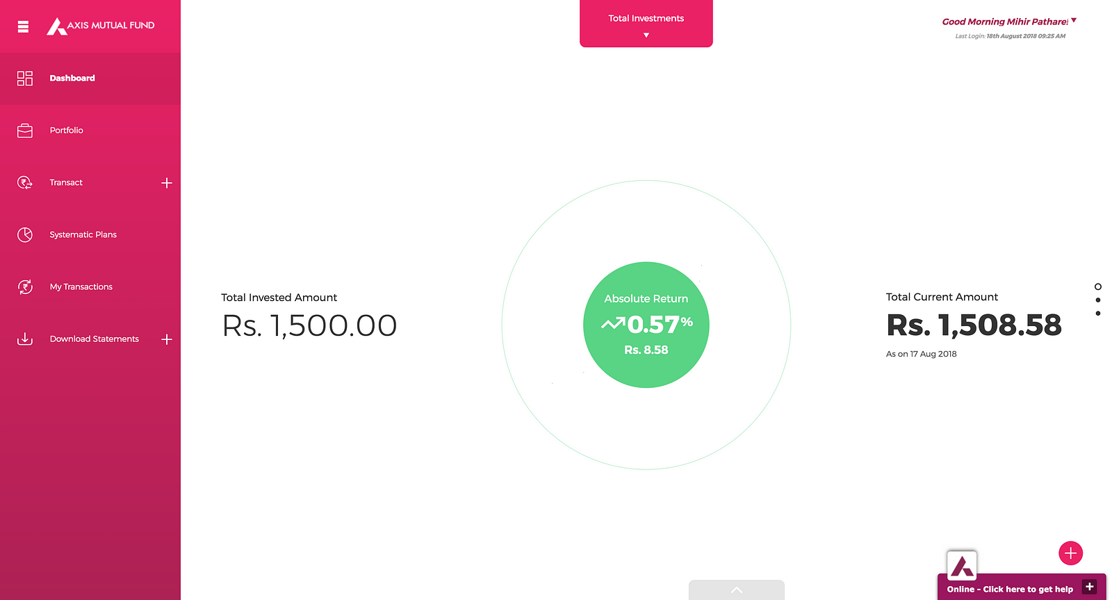
Axis Mutual Fund’s new website has introduced a simplified, easy to understand and use experience for mutual fund investments in India.
