Introduction to RightScale Self-Service
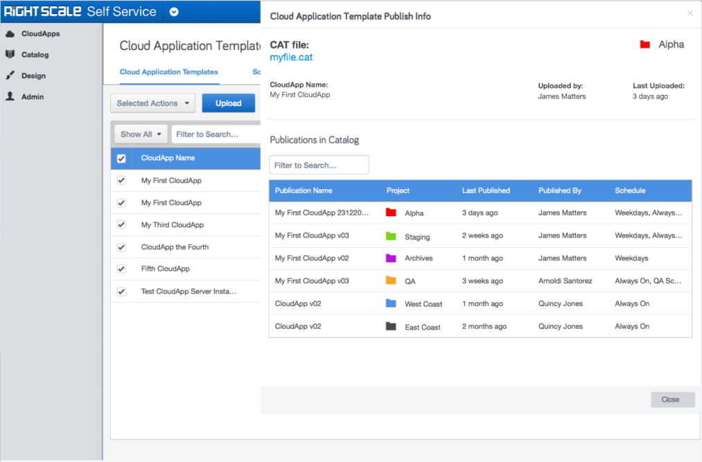
RightScale Self-Service provides an easy-to-use portal for automated deployment of cloud applications and policy-based governance over cloud usage. It empowers developers and even non technical users with on-demand access to cloud infrastructure to accelerate innovation, streamline development.
Self-Service is RightScale’s youngest product and new features are regularly being added to it. One of the biggest asks from our customers was for a better way to manage their CloudApps. It’s users are customers like Technicolor, Zynga, Offis, Audi, Volkswagen Group of America, Pinterest, and many, many others.
Index
- Projects in Self-Service
- Challenges
- Mapping the IA for Self-Service
- Ideation with Whiteboards, Pen and Paper
- Using Sketch for Wireframes
- Prototypes
- Usability Testing
- Documentation
- Final Wireframes
- Development
- In Conclusion
1. Background for “Projects” in Self-Service
Projects in Self-Service are organizational structures. The high level requirements for projects in Self-Service were fleshed out by project management, based on customer requests and their workflows. But there was still much work to be done before it could be actually realized.
For customers, projects allow them to:
- provide selective access to the users in the organization.
- create spaces within Self-Service for different entities / groups to work in, without running the risk of accidentally accessing resources .they should not or do not want to have access to.
- silo the development workflow according to their own organizational schema
- make navigation of Self-Service easier by filtering to show only the projects that the user is currently working with.
2. Challenges
So, we seemed to have an idea about what we needed to do, right? Not really. Self-Service is the simplest interface you’ll see that hides the complexity of setting up, managing and orchestrating a multi-cloud, or hybrid cloud setup. It’s just as complex as you think it is.
Challenges I faced on this design task:
- Incomplete or missing design documentation.
- Design for different workflows used by different clients.
- Plan for future organizational features that go beyond the Projects paradigm.
- Design for new, potentially unknown error situations.
- Select an accessible color palette that did not conflict with customization options offered.
3. Mapping the IA for Self-Service
One of the first things I did was map the entirety of Self-Service in a mind map using MindMeister. This screen cap of the work in progress will give you an idea about what the basic IA of the product looks like.
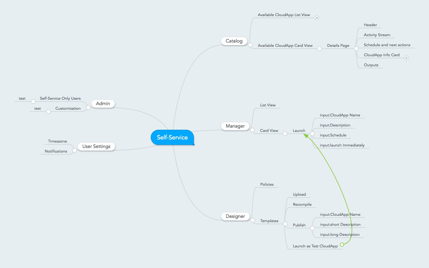
Once this was done, it was fairly easy to identify the areas of Self-Service that would be affected by the Projects UI design work. This mindmap also helped design for new features. A quick glance allowed me to understand what parts of the product needed updates and consideration in the new designs.
4. Ideation with Whiteboards, Pen and Paper
Initial design work always happens on the whiteboard. Whiteboarding allows me to iterate on the user flows and ui design quickly, and lets me try cycle through different combinations of ideas to arrive at the best solution. Daily check-ins with product management and the UX team provided the much needed feedback about the direction my designs were going in.
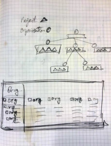
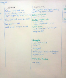
One of the best ways to design for existing UI is to project it on a whiteboard, and then go crazy with the marker. I’d often invite co-workers from different departments to share their insight into the design, so that I could benefit from their understanding of customer behavior.
5. Using Sketch for Wireframes
Once the wireframes on the whiteboards start taking some shape, I build them out in Sketch and Axure. Each serves a different purpose, and Sketch wireframes are prioritized because they are faster to build.
As this was my first project at RightScale, I built a library of common UI elements that I could reuse to mock up new designs.
Remember. The more often you get feedback about your design, the faster your design approaches the best version of itself. Iteration is the heart and soul of any good Design process.
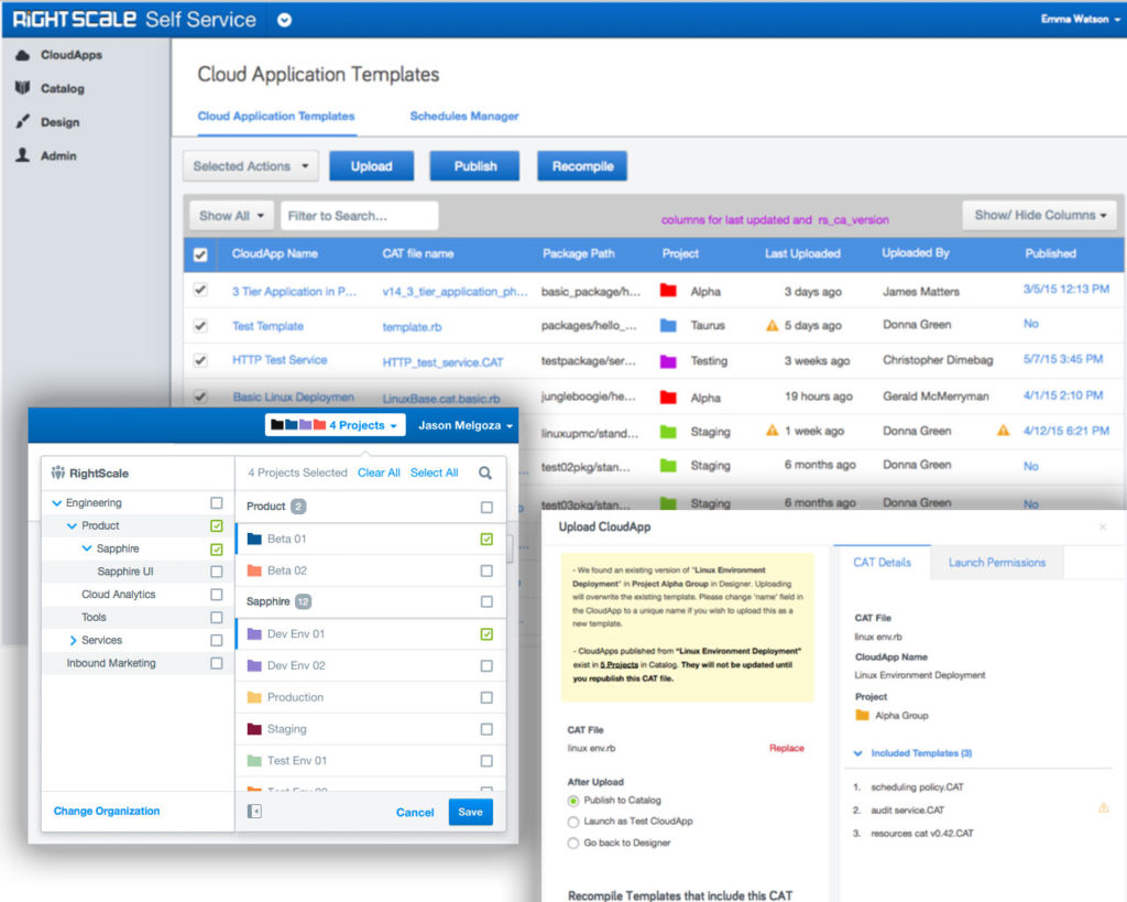
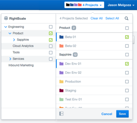
There were a total of 12 areas where updates had to be made to accommodate Projects UI, including two major workflow changes, and the implementation of a projects selector that was it’s own major design task.
6. Prototypes
Static wireframes are good to get initial feedback, and are helpful for the developers to refer to when they start building the new features, but they are not very effective at getting feedback from customers.
Interactive prototypes that simulate or replicate the intended functionality are the best for usability testing. More about this later.
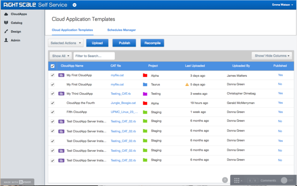
Sketch wireframes are easy to turn into basic interactive prototypes using Invision
You may try one of the prototypes I have built here http://bit.ly/25MDv3n Please make sure you adjust the width of your browser window to match that of the prototype.
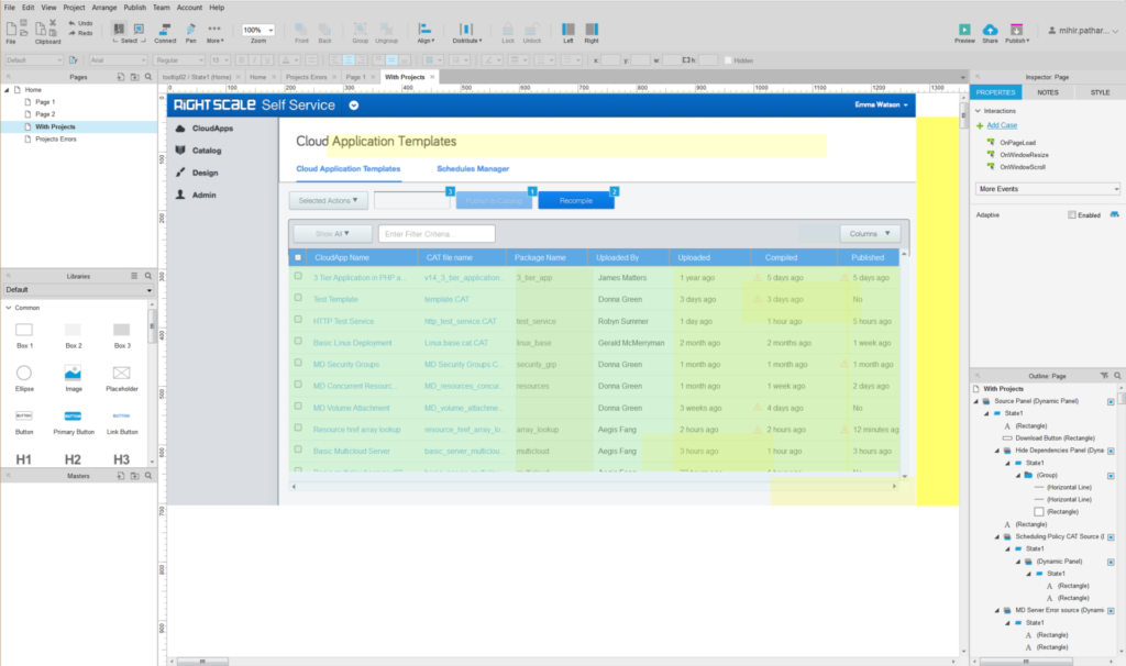
Axure prototypes are more complex to build, but feel closer to the real thing. You can try one of my prototypes out here http://bit.ly/1Naf4S8
This axure prototype was built for use with the fonts and custom CSS that RightScale uses in it’s own products. It may not render correctly on your machine.
In addition to this, an angular.js app was developed by our Sr UI Designer for testing the new projects selector. You can take a look at that here http://troubled-produce.surge.sh/
7. Usability Testing
RightScale’s customers (users) are all over the world, and use of the software requires very technical domain knowledge that makes it impossible to conduct any usability tests outside of our customer base. Is such a situation, I conducted remote usability tests to observe customers using the new designs, and get customer feedback
For more insight into how I conducted usability studies at RightScale, please see this article.
8. Documentation
Internal Documentation at RightScale was little more than wiki articles written by engineers and developers, and a design documents that served more of an outline of what’s being planned, rather than what has already been built. While RightScale is an agile startup, years of development with no proper documentation about whats been built made it difficult for me to design new features without talking to the devs, QA, product managers, or extensively testing the product for it’s behavior in certain situations and edge cases.
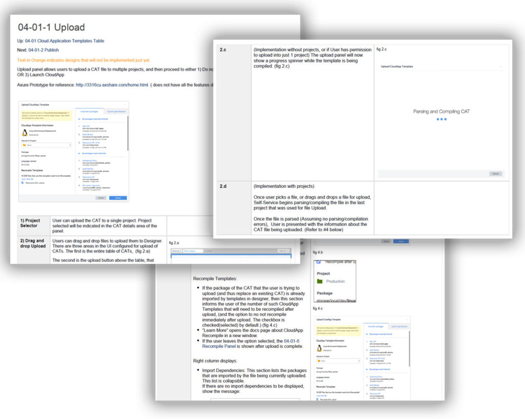
To remedy the situation, I implemented a highly detailed, modular documentation system that allowed me or any other team member to keep on top of what’s being built, what is going to be built, what’s being designed, and what’s being explored for viability.
View a sample of my documentation here http://bit.ly/1S4oqGs
For more insight into my documentation, check out this article.
9. Final Wireframes
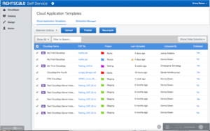
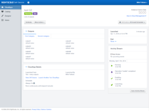
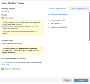
By the end of the usability study, the design had undergone atleast 25 iterations from the time it left the whiteboard. The design touched all parts of the Self-Service product. These are the final wireframes I made for the major feature implementations.
10. Development
Once this goes into development, there is first a kickoff meeting where I talk about the final design and demonstrate the entire functionality of the product, and clarify any doubts that the engineering team might have about it. After that, there are weekly checkins where I make sure that besides the basic functionality, the micro-interactions are being built properly as well.
At every step of the way, there is an opportunity to take the feedback received through any channels, and use that to update the design and prototype as required. Sometimes it might feel like hitting a moving target, but because of the robust documentation style I have implemented, the engineering team has little trouble with the design process.
11. In Conclusion
Projects for Self-Service was a large design endeavor that touched on all parts of the product and allowed me to understand and make changes to the design process at RightScale. The feedback for the final design has been nothing but positive from both internal stake holders and customers. I am confident that it’s addition to Self-Service will be well received.
