Introduction
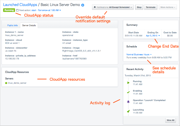
Self-Service details page shows various information about the running CloudApp including run status, uptime statistics, a log of recent activity, output values, and configuration settings.

This page was designed in 2013, and RightScale’s customer demographic has changed over time. This page was the first
Project Brief
I was tasked with understanding the needs of the customers, and redesigning the Details page to make it more efficient for use by different persona types identified by product management.
Design
I follow an iterative design process that involves research and discover, feedback driven design followed by usability testing and comprehensive documentation. Briefly outlining the steps I took:
- Interview internal stakeholders to identify their needs, and their understanding of the users’ needs.
- Researched existing design solutions for the problems presented
- Mock up and prototype new design
- Prepare usability study to get customer feedback.
Usability testing
The usability test I planned and conducted validated a lot of findings. Every session drove minor changes to the design that were carried forward to the final version.
Findings of the usability study:
- Users needed quick access to their environment setups in RightScale Cloud Management
- Some way to communicate with other users of the CloudApp
- Quick access to outputs
- Ability to “clone” a running CloudApp
- Cleanup stale CloudApps used for testing
Final Design
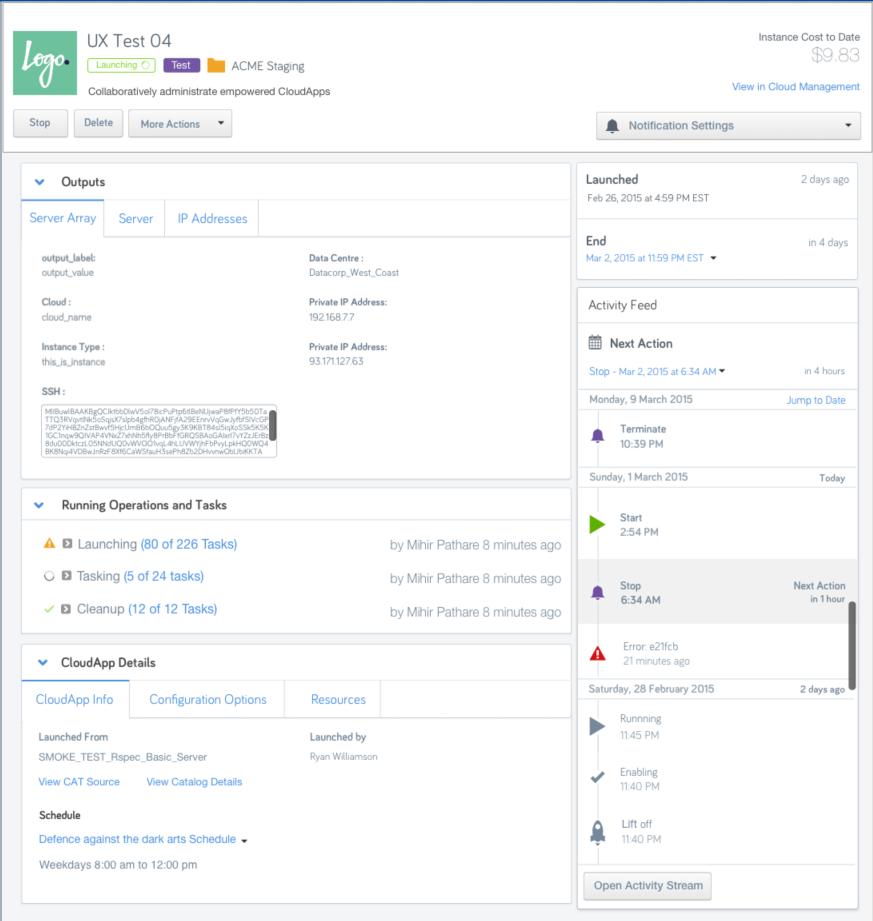
The final design after more than two dozen iterations and validation from users was a major usability advancement for the product.

The changes are briefly outlined below
- The design reorganized existing data to optimize user’s workflows
- Selective prioritization of different data, depending on user types
- Reorganization of all infrequently used information in a single section, and larger focus on the outputs and activity logs – the most used parts of the page.
- Many microinteractions aimed at optimizing the experience of the page according to each user’s type.
Results
The launch of the new details page was very well received. Users of different types appreciated the different views catering to their workflows, and the ability to monitor and debug issues with their environments much faster than before.

